
What should you make first in DeckCraft?
Start with a short presentation that has one clear purpose: explain a problem, show your evidence, and ask for a specific decision. Six slides are enough to learn the workflow without spending your first session managing a large document. A project update, a classroom explanation, or a proposal for a small improvement all work well.
If you searched for “deck craft” or “DeckCraft slides,” this guide is about the presentation editor. You can open it from the DeckCraft homepage or go straight to the online workspace. For an installed application, follow the download and installation guide. The browser and desktop releases may differ, so use the controls visible in your version rather than assuming every feature shown in newer documentation is available.
DeckCraft is an open-source presentation application, and the upstream project still describes it as alpha software. Treat your first document as a trial: use a copy of any existing presentation and check the saved output before relying on it. The project overview and current feature list are the source for its development status.
The practical goal of this tutorial is a deck you can reopen, understand without its author beside you, and present on the device that matters. Decorative polish comes after those three requirements.
Plan a six-slide story before choosing colors
Consider a fictional team proposing a simpler onboarding process. The presentation needs to help a manager decide whether to run a pilot. Before touching a layout, write one sentence for each slide:
- Proposal: Run a two-week onboarding pilot for the next small group of customers.
- Problem: New customers are unsure which setup task to complete first.
- Evidence: Show where questions accumulate, using your own verified observations.
- Solution: Replace a long checklist with three clearly ordered milestones.
- Pilot: Assign an owner, a schedule, and a way to collect feedback.
- Decision: Ask for approval and identify the next action.
These are example claims and a suggested structure, not research results. Replace them with evidence from your own project. If you do not have a measured improvement yet, write “we will measure completion time” instead of inventing a percentage. The audience should be able to distinguish a finding from a prediction.
Next, put a question beside each sentence. What will the audience need to believe before accepting the recommendation? Which terms require a definition? What objection is likely to come up? This gives you a reason to include a diagram or example instead of filling slides with background information.
For a teaching deck, replace the decision with a learning objective and a short exercise. For a portfolio, replace the pilot with a process and a result. The sequence can change, but every slide should do a recognizable job. If two slides answer the same question, combine them or make the distinction explicit.
Learn the workspace with the sample deck
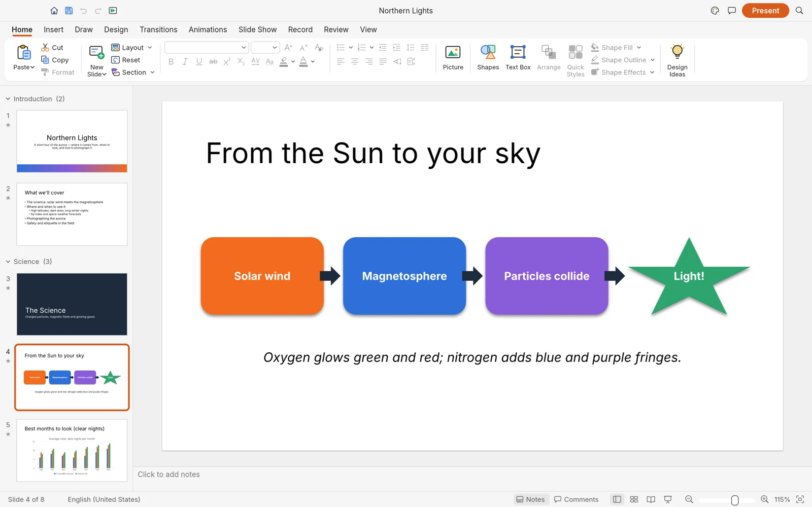
Open the editor and inspect the sample before starting a new document. The thumbnail rail helps you move between slides; the central canvas shows the active slide; the ribbon groups editing actions. Click a text object and then a shape to see how the available formatting changes. Selection is the first thing to check whenever a control appears inactive.
Use the sample as a map of the application, not as content to submit under your own name. Notice how a title, a diagram, and a chart require different arrangements. Look at the spacing between objects and the relative size of titles and labels. You can learn more from one complete example than from changing every setting on an empty slide.
To begin your own deck, save any work you want to keep, then use the new-document action. On this site's browser wrapper, New blank deck resets the workspace after a confirmation. Keep the online editing guide open in a separate tab if you need help with loading, full-window mode, or downloading your work.
Create the first slide and enter a meaningful title. “Approve the onboarding pilot” tells the audience more than “Introduction.” Add a subtitle only when it gives necessary context, such as the team, date, or scope. Move to the next slide once the message is understandable; you can align everything in a later pass.
Build a consistent layout you can repeat
Choose a small set of visual rules and keep them throughout the deck. Start with one background, one main text color, one accent color, and two or three text sizes. Use the accent to identify an action or a key result. If every object is emphasized, the audience has to decide what matters without your help.
Make a simple content slide that you can reuse: a title at the top, one main area for evidence, and a short source or explanation at the bottom. Keep the title position steady between slides. Reusing an arrangement reduces accidental differences and lets you focus on what the next slide needs to say.
Use font size as a starting point rather than a guarantee of readability. A large room, a small screen, and a dense table produce different constraints. Preview the slide at its actual presentation size and move farther from your screen. If a line is hard to read, shorten it or separate the material before shrinking the type.
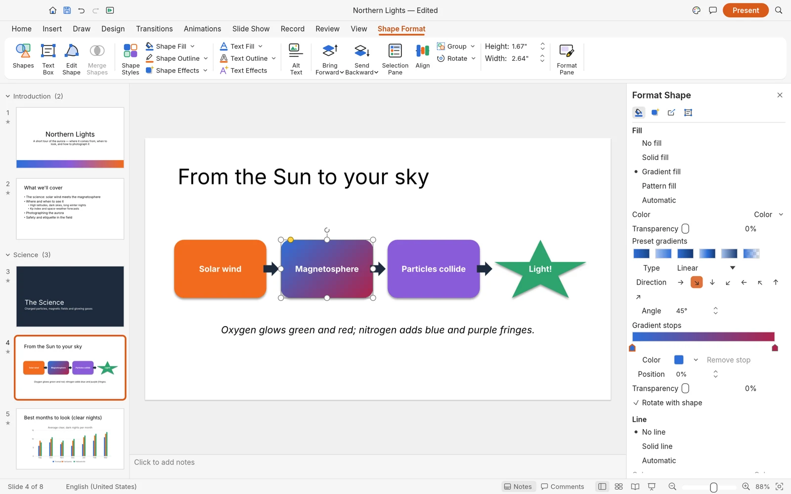
For the onboarding example, use a three-step process on the solution slide and a short timeline on the pilot slide. They can share colors and typography without sharing an identical composition. Consistency means the audience recognizes the visual rules; it does not require every slide to contain the same number of boxes.
Check alignment in a separate pass. Compare left edges, distances between objects, and the space above and below headings. Leave room around the important element. If a slide feels crowded, remove a secondary point or move it to a following slide. Empty space helps the reader see the structure.
Add visuals that answer a question
A visual earns its place when it explains something faster or more clearly than the text alone. Use a screenshot to show a specific interface problem, a chart to compare values, a diagram to explain relationships, or a photograph to identify a real subject. Avoid adding a decorative image that forces the useful content into a smaller space.
Before inserting an image, decide what the audience should notice. Crop away irrelevant areas when appropriate, preserve the aspect ratio, and add a short caption. Use images you own or have permission to reuse. A screenshot containing customer names, email addresses, or internal links should be replaced with a sanitized example before it enters a public deck.
For a process diagram, build the smallest number of steps that preserves the meaning. In our example, “Create account → Complete setup → Review first result” is a usable starting point. Give each step an action verb. Place the labels in the same position and keep arrows consistent. Read the diagram from left to right to make sure it follows the order you will describe aloud.
When showing data, label the unit, time period, and source. “12” is not useful without knowing whether it refers to customers, minutes, or requests. Do not mix percentages and absolute counts without explaining the relationship. A simple chart with clear labels is more persuasive than a complex chart whose calculation the audience cannot reconstruct.
Sequence the deck and rehearse the explanation
Read only the titles from beginning to end. They should form a coherent outline. If the deck jumps from evidence to a recommendation without explaining the connection, add a transition sentence or reorganize the slides. Slide order should follow the audience's reasoning, not the order in which you happened to create the content.
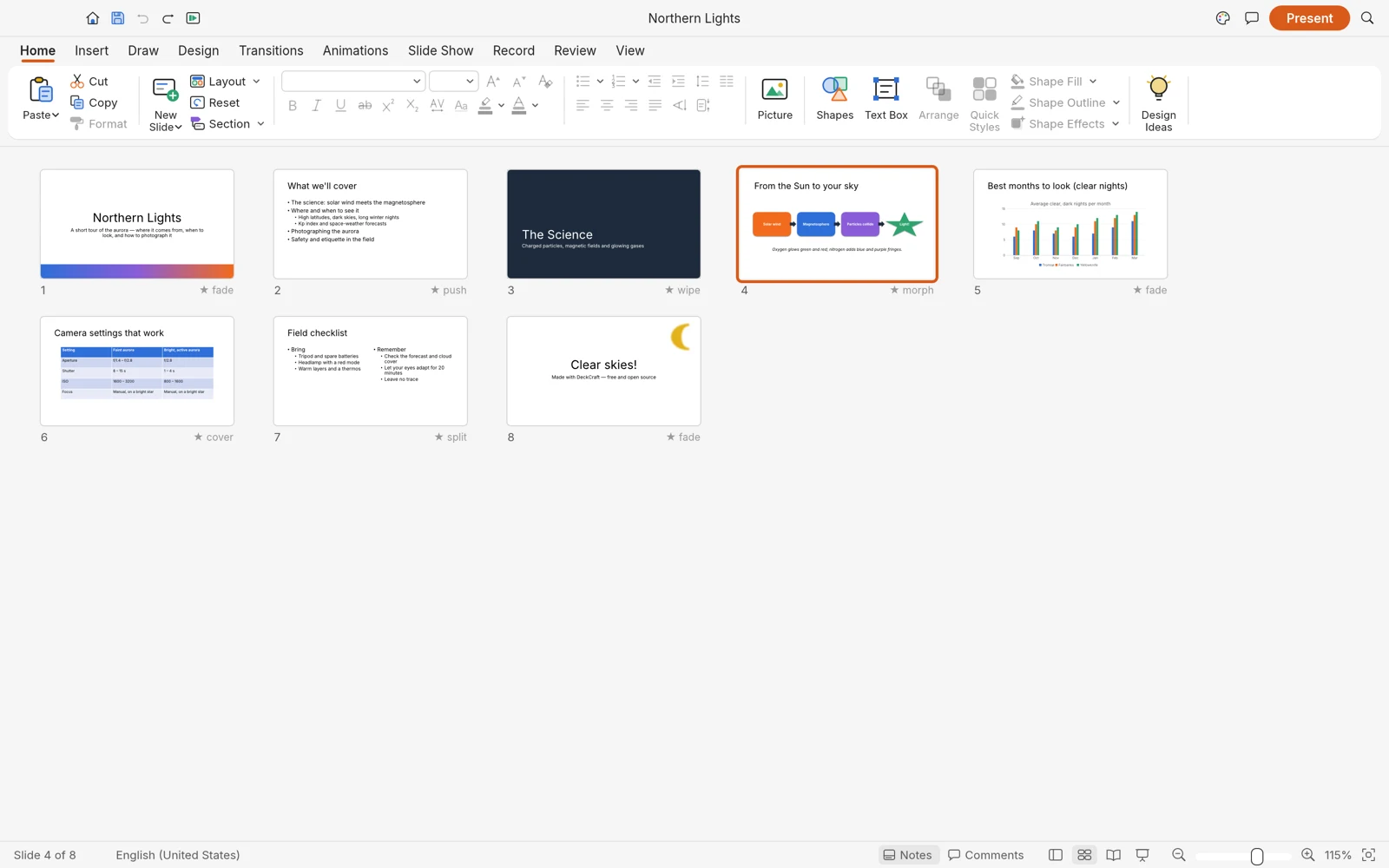
Use motion only when it helps your explanation. A progressive reveal can keep attention on the current point, but the underlying slide should remain understandable when viewed without animation. For a first deck, a restrained transition style is easier to check and less distracting to present.
Rehearse with a timer and speak the explanation out loud. You will find awkward wording that silent reading misses. Give more time to the evidence and the decision than to the title slide. If the talk runs long, remove a secondary idea instead of rushing every sentence. Prepare a short version of your conclusion in case the meeting ends early.
Test presentation mode on the device and display you expect to use. Check the first and last slides, navigation, any media, and the smallest labels. If you will screen-share, verify which window the audience sees. Keep an alternate static copy when your workflow supports one, and know where it is stored.
Save, reopen, and inspect before sharing
Saving is a workflow, not a final click. Give the document a recognizable name, include a revision or date when useful, and keep the original source separate from the copy you send. A name such as onboarding-pilot-2026-11-05-review.pptx communicates more than final-final2.pptx.
Use the file commands available in your build to save or export. In a browser, verify that the resulting download actually exists in your download folder. Do not assume that seeing the slide on screen means it is backed up. Before resetting the editor, reloading, or closing the tab, confirm that you have a usable copy.
Open that copy and inspect every slide. If someone else will edit it in PowerPoint, open the exported PPTX there too. Compare text wrapping, font substitutions, image crops, diagrams, chart labels, notes, and animation behavior. A successful import confirms that the file can be opened; it does not establish that every detail survived unchanged.
For a client or team handoff, include a short note describing what is editable and what needs attention. State whether the recipient should use the file for presenting, reviewing, or further authoring. If visual consistency is more important than editability, discuss a static delivery format alongside the editable source. The PowerPoint comparison guide explains how to test a mixed-tool workflow.
Fix common first-deck problems
A formatting control is unavailable
Check the selected object and whether you are editing its text or selecting the whole object. A fill control applies to a shape, while paragraph controls apply to text. Try the same action in the sample deck to distinguish a selection problem from a limitation of your installed build.
The slide has too much text
Write its main point as one sentence. Keep only the evidence needed to support that sentence on the slide. Move explanations into your spoken delivery or split the slide into a claim and an example. Reducing font size usually hides the problem instead of solving it.
The exported file looks different
Keep both files and compare one representative slide at a time. Start with fonts and text boxes, then examine image positions and effects. Simplify the affected element and repeat the save-and-reopen check. If the mismatch is essential to your presentation, finish that portion in the destination tool rather than assuming the issue will disappear on another computer.
The browser workspace stops responding
If saving is still possible, preserve the current work first. Avoid repeatedly resetting the page while your only copy is open. For a reproducible problem, record the browser, application version, and the smallest set of steps that causes it. Use the online troubleshooting section for browser-specific checks.
Frequently asked questions
Is DeckCraft a good place to learn presentation design?
It can be a useful practice workspace for learning slide structure, typography, diagrams, and rehearsal. Begin with a small project and validate the save workflow. Those habits transfer between presentation tools even when individual controls differ.
How many slides should my first presentation contain?
Use the six-slide example as a manageable exercise, not a universal rule. The right length depends on the audience, time available, and the decision or learning objective. Remove slides that repeat a point without adding evidence or explanation.
Do I need to install the desktop application?
You can begin in the browser editor. If that environment does not suit your device or you want to evaluate an installed workflow, follow the installation guide. Test the same small deck in the version you plan to keep using.
Where can I get help with a problem?
For the independently operated website, use the contact information on the homepage. For an upstream application issue, consult the project issue tracker and include a reproducible, nonconfidential example. Do not attach your only copy of an important document.
Put the guide into practice
Return to the homepage to explore the editor, create a small test deck, and try the workflow with your own content.